At Wilson, we believe great brands can live forever… if they are bold enough to renew, refresh, and even reposition themselves to evolve with their audiences. We apply this thinking to our own brand, too, which is why you’ll see a fresh look and feel here on our website and across all of our communications.
Our new branding is a clear evolution of our existing brand. The Wilson logo, a compass, still signifies what we bring to brands: a new direction, a roadmap out of a cluttered landscape. Even exceptional brands can lose their way. Our job is to get you back on the road to success. We specialize in working with established brands in mature industries, and it was important to us to get that across in our new look and feel as well.
Distilling the Brand Promise
Our new tagline needed to communicate our brand promise simply and boldly. A brand promise should distill the very essence of what you do and who you do it for. Thus, our new tagline was born:
Fresh direction for established brands.
Sounds simple, doesn’t it? Good! That’s the idea.
The Yin and Yang of Logos
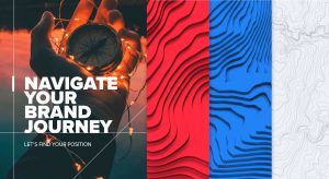
Our compass is split into two primary colors, red and blue. Red represents the fiery passion of our creative ideas. The blue represents the cool-headed strategic side. These two approaches to our work form our Yin and Yang; one can’t exist without the other. They also come together to point Northeast… forward and upward – the same directions we take brands!
![]()
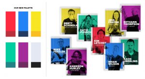
Vibrant Colors and Vibrant People
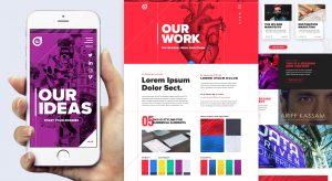
Our own fresh direction began with a more vibrant color palette. At Wilson, our creative team is exceptionally creative and courageous, full of big personalities with a passion for life and adventure. Our brighter color system communicates the bold uniqueness of our people, the brilliant minds behind our brand. We have also moved further into the technology space over the last few years, building out experiential design pieces, apps, VR/AR, and more which are now among our core offerings. This vibrant, modernized color system was also designed to play well in that space. Our five core color hues were chosen to complement our agency’s proprietary methodology, The Five Gates of Branding: one hue for each gate a brand must walk through to achieve immortality.
Unique Design Elements
We are now using dimensional topography map patterns with our colors applied. These maps are the visual representation of the unique journeys that every brand takes throughout its lifetime. Each brand encounters different challenges, represented here as hills, valleys, and roads. Wilson is the compass brands use to navigate these spaces.
We have also added intersecting lines as graphical elements. These thin lines signify how we plot out your brand’s course, whether that’s its strategic positioning or a multi-channel campaign. Great work starts with planning and exploration. Wilson methodically analyzes brands through deep research and strategic thinking, then plots a course and marks out your brand’s position. Thus, your brand lives here at the intersection of strategic thinking and creative vision – all visually represented by these simple lines.
Our Home Base
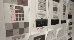
Our website uses flat and material design elements to give it a modern, tactile feel. Content is king on our site, and we have ensured all of our content is big, bold, and easy to read. Our site is built to be agile and fluid, ensuring that we can create and promote content relevant to the established brands whose stories we’d like to tell, and the brands who already trust us to help them navigate the future. The type is bold, chunky and confident. That’s because when we say something, we mean it!
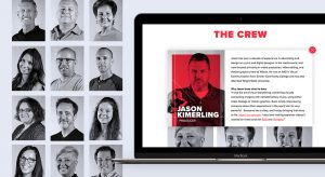
Highlighting Our Exceptional Crew
We have also added more information about our incredible crew to our website. At Wilson, we understand that our product is the creative and strategic experience and genius of our team. We have great people, and we want to highlight that!
We hope you’ll take some time to explore our new website. If you’re curious about our methodology, and how we develop fresh direction like this for brands like yours, do reach out to us.
Learn more about how legacy brands can discover renewed growth in our ebook, Five Gates of Branding.